

The CRE Broker's Guide to Custom Branding: Look Like a National Firm on a Solo Budget
Independent brokers lose listings to national firms partly on perceived professionalism. Consistent branding across every document is the fastest way to close that gap.
Key takeaways
- Brand perception affects listing decisions before the meeting starts — owners form impressions from the BOV header and OM cover before reading a word.
- Four brand touchpoints determine your perceived professionalism in CRE: OM cover, BOV header, flyer design, and listing website.
- Brand consistency is not just logo placement — it's typeface, color, image treatment, and language applied uniformly across every document.
- A brand system that applies automatically to every new deal eliminates the inconsistency that comes from manual formatting decisions.
Why branding matters more than most brokers think — the first impression before the meeting
The decision about which broker to list with is often made before the meeting begins. Owners research brokers online, look at recent deals, and form impressions from the marketing materials they can see before a word has been spoken. A broker whose digital presence, OMs, and BOVs look polished and consistent sends a clear signal: this person runs a professional operation and will represent my asset at the same standard.
The problem for independent and boutique brokers is that national firms have dedicated marketing departments producing consistent, high-quality materials at every touchpoint. A solo broker or small team competing for the same listings is often doing their own marketing — and the difference in perceived professionalism is visible before anyone has evaluated the quality of the advice.
This gap is not inevitable. The national firm's advantage is not talent — it's consistency. Their OMs all look alike because they use the same template. Their BOVs all have the same header because it's applied automatically. Their flyers all carry the same color palette and typography because there's a brand system that enforces it. An independent broker with an equally strong brand system can produce the same consistency — and can actually use that consistency to build a more recognizable personal brand than any individual agent at a large firm.
The first question to ask honestly: if an owner Googled your name and looked at five deals you've marketed in the last 18 months, would they see a coherent brand? Or would they see a mix of templates, color schemes, and layouts that suggest each deal was produced independently? The answer to that question tells you where you stand on the perception gap — and how much work the brand system needs to do.
The four brand touchpoints that matter in CRE: OM cover, BOV header, flyer design, listing website
Not every piece of marketing collateral is equally visible to the decision-maker. In CRE, four touchpoints consistently shape the owner's perception of your brand — and if these four are consistent, the overall impression is one of a professional operation regardless of what anything else looks like.
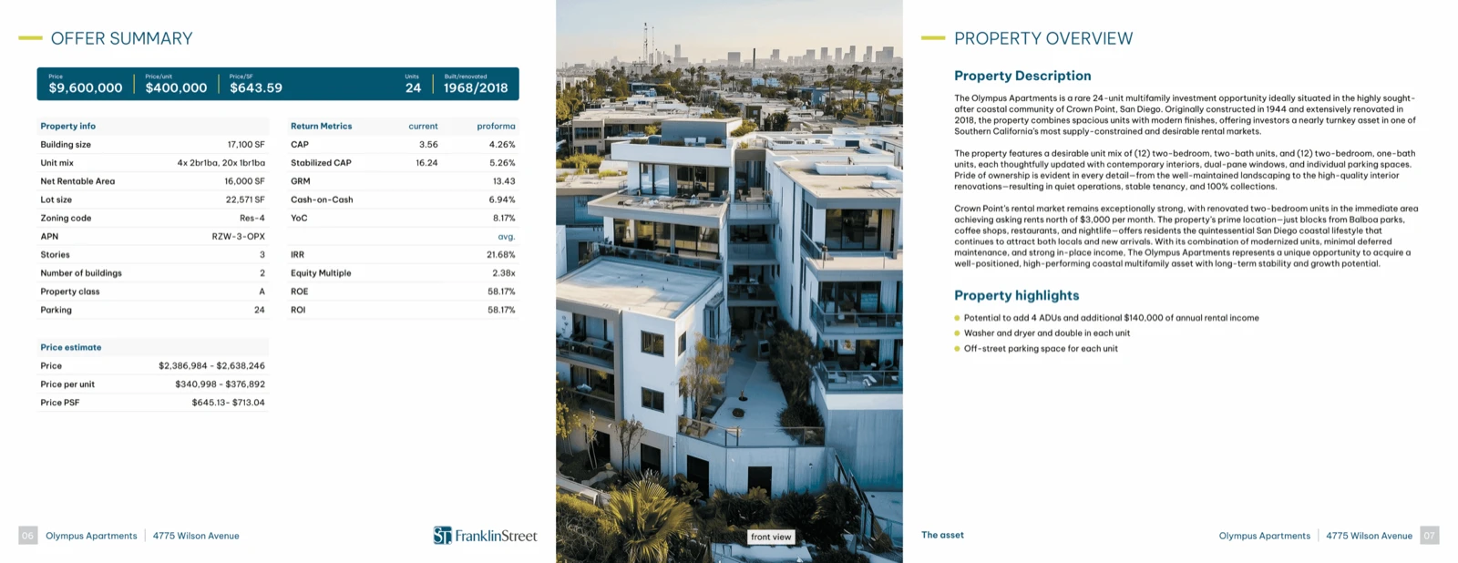
The OM cover is your most powerful first-impression document. It's the first thing an owner sees before deciding whether to read the investment case. A weak OM cover — poor photo selection, misaligned type, inconsistent color treatment — signals that the underlying work may not be of high quality. A strong cover, with a professional property photo, clean typography, and a consistent color palette that matches your other materials, signals before the first sentence that this broker knows how to present a deal.
The BOV header is where you win or lose the credibility battle in the listing pitch. When you slide your BOV across the conference table, the header sets up whether the owner reads the analysis as authoritative or routine. National firms win this moment consistently because their BOV headers are branded and polished by default. A BOV or pitch deck with a clean, branded header signals that the broker has invested in their tools — which implicitly signals that they'll invest the same level of care in the deal.
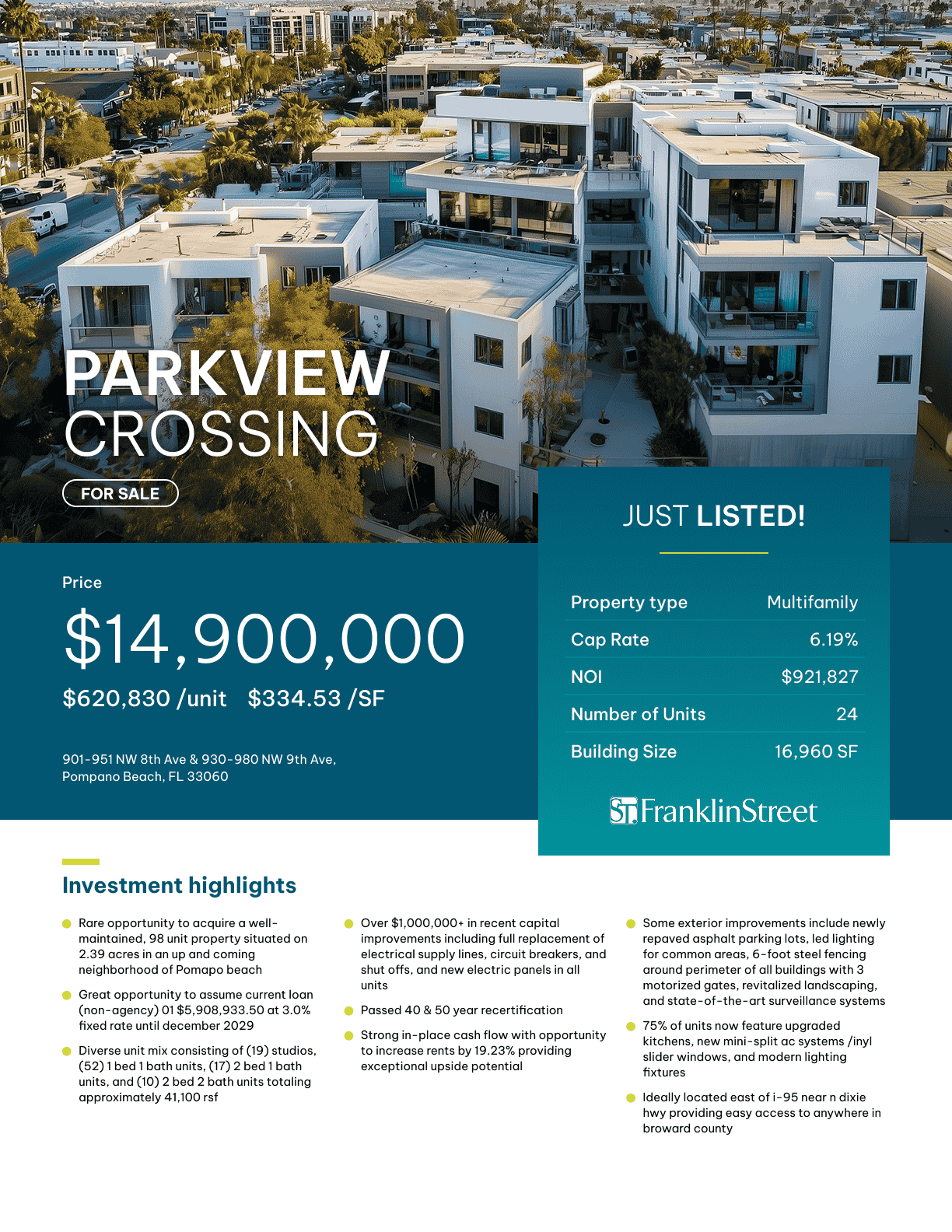
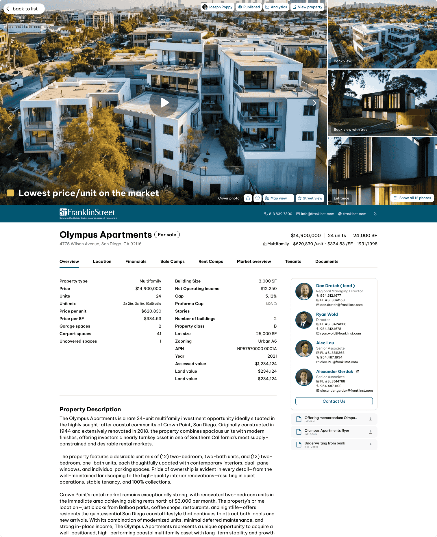
The flyer and listing website are the two external-facing touchpoints — the ones buyers and other brokers see. If your flyer looks like a different company's work than your OM, buyers notice. The cognitive dissonance of inconsistent branding creates a subtle but real sense that the deal is less professionally managed than one where everything looks like it came from the same firm.
Own all four touchpoints with the same brand system, and you've closed most of the perception gap between your operation and any firm three times your size.
What brand consistency actually means in practice (it's not just a logo and a color)
Most brokers, when they think about brand consistency, think about their logo and their primary color. Those two elements are necessary but not sufficient. Real brand consistency involves five components working together across every document.
Logo placement: same position, same size, same clear space on every document. The most common failure is a logo that floats at different scales across different templates — large and prominent in the OM, small and pushed to a corner in the flyer, inconsistently sized in the listing website header. Pick a standard treatment and enforce it everywhere.
Color palette: two to three brand colors, used consistently across backgrounds, headlines, and accent elements. "Brand colors" doesn't mean your logo color appears somewhere on every document — it means every design decision about color is made from the same palette, applied with the same logic. A header that's navy blue in your BOV should not be charcoal gray in your flyer.
Typography: one headline font, one body font, applied at consistent sizes and weights. Typography is one of the most powerful brand signals, and it's one of the easiest to get wrong when documents are assembled by hand. A broker whose OMs use a different headline font than their flyers looks like they're using borrowed templates — which they usually are.
Photography and image treatment: consistent color grading, consistent crop ratios, consistent style (wide establishing shots versus close-up detail shots, for example). This is the most overlooked brand consistency element in CRE, and it has an outsized effect on perceived quality.
Voice and formatting: the tone of your property descriptions, the label conventions in your financial exhibits, the structure of your executive summaries. Consistency here tells repeat readers (and owners who get multiple OMs from you across different deals) that they're working with someone who has a system, not someone improvising each time.
Start your brand consistency audit with the four highest-visibility documents: your OM cover, your pitch deck, your property flyer, and your listing website header. If those four elements are consistent, the brand perception battle is largely won.
How to set up a professional brand system without a design team or a large budget
The traditional answer to brand consistency has been to hire a marketing coordinator or a design agency, invest in a brand refresh, and build out a library of templates. That approach works for firms with $500K+ in annual marketing budgets. For a 1–5 person broker team, it's overkill and cost-prohibitive.
The practical alternative is a brand system built on automation rather than manual enforcement. The principle is simple: if your brand elements (logo, colors, fonts, headings, photo style) are locked into the tools that produce your marketing materials, then every document is automatically branded — no designer required, no manual checking required, no inconsistency possible.
The first step is establishing your brand inputs: logo file in vector format, primary and secondary hex codes, and font selections. These are the raw materials. Get them right once — with help from a freelance designer for a half-day engagement if needed — and then build everything downstream on those inputs.
The second step is choosing tools that apply those inputs automatically rather than giving you a blank canvas. Template-based document tools where you lock the brand design are fundamentally more consistent than general-purpose design tools where every document is a new creative decision. The goal is to remove discretion from the production process so that brand consistency is enforced by default, not by discipline.
For the full walkthrough of how to apply your brand to every document type, set up your custom branding in IntellCRE is the place to start. With IntellCRE, your brand is applied automatically to every OM, BOV, flyer, and listing website from the same source — which means consistency is structural, not aspirational. The one-time setup investment pays dividends on every deal you produce thereafter.
Maintaining brand consistency across team members and multiple deals
The hardest part of brand consistency for a small broker team is not setting it up — it's maintaining it when multiple people are producing documents simultaneously, under deal timelines, without a dedicated quality-check process.
The most common failure mode: an associate produces a flyer using a slightly different template than the one the lead broker uses for OMs. The color is close but not exact. The logo is the right file but at the wrong size. The result is two documents from the same deal that don't quite look like they came from the same firm — and if they reach the same buyer, the inconsistency is immediately visible.
The fix is to remove template optionality. Every team member should produce every document from the same locked template system, with brand inputs that cannot be overridden without administrative access. If your tools allow individual users to change fonts, swap colors, or resize logos, those permissions should be locked. Brand consistency is not a design preference — it's a production standard that needs to be enforced by the system, not monitored by a manager.
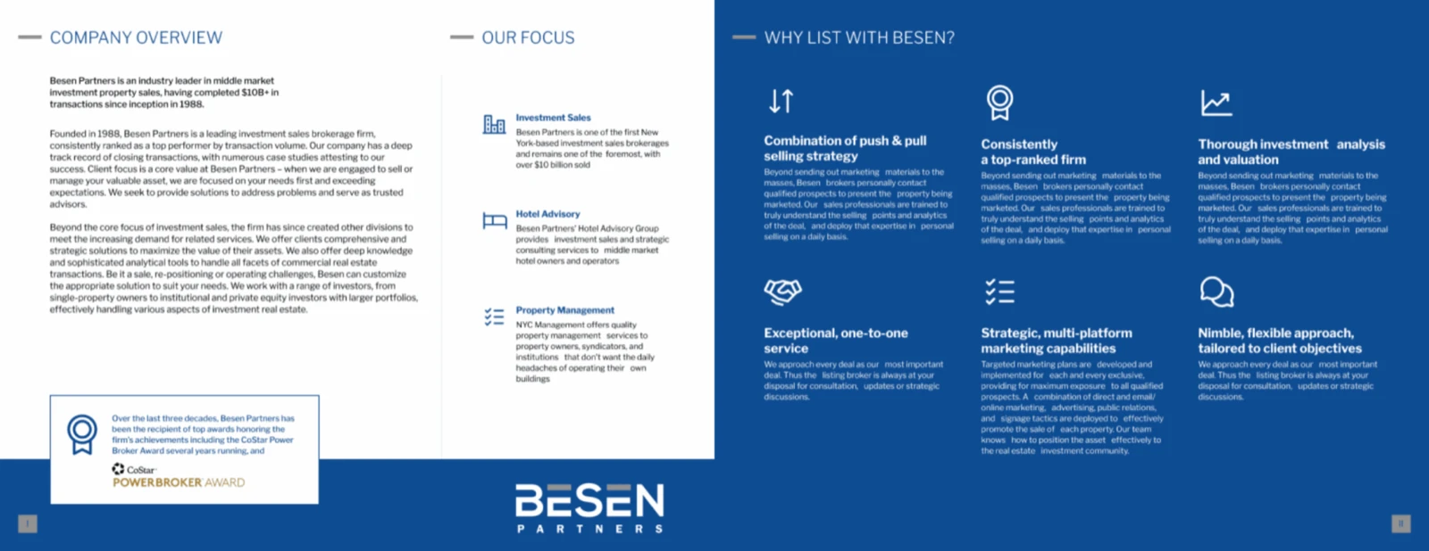
For teams where bio pages and individual agent profiles are part of the marketing package — which they increasingly are for multi-tenant or institutional deals — automated bio pages eliminate one of the most common inconsistency points. When bio pages are generated automatically from a team member's profile rather than assembled by hand, the formatting is always correct and the brand is always applied correctly.
The practical standard to hold yourself to: print out the last five documents your team produced across different deals. Set them side by side. If they look like they came from the same firm, your brand system is working. If they look like a collection of templates, you have a system problem — and the answer is automation, not more training.
Frequently asked questions
How much should I invest in a brand refresh before setting up a brand system?
For most independent brokers, a focused half-day engagement with a freelance graphic designer — to select a professional typeface pair, refine your color palette, and produce a clean vector logo in multiple formats — is sufficient. Budget $500–$1,500. The brand system you build on those inputs will last years. A full agency rebrand is not necessary unless your current brand has fundamental problems.
What if I'm affiliated with a national brokerage that has its own brand standards?
Most national brokerage affiliations allow for a co-branded treatment where your personal or team brand appears alongside the company brand. Work within the co-branding rules to build a consistent personal identity within those constraints — your name, your photo, your tagline, applied consistently across every document. Buyers and owners increasingly remember the broker, not the brokerage.
How do I handle branding for a team where each broker has a different personal brand?
Create a team brand that all members operate under, with individual bio pages that allow for personal differentiation within a consistent visual framework. The team brand handles all deal-level documents; the individual brand lives in bio sections and personal social profiles. This structure keeps the deal presentation consistent while allowing each broker to maintain a distinct personal identity.
Does brand quality actually affect whether I win listings, or is this just aesthetics?
It affects the probability of winning listings, not the certainty. An owner comparing two brokers with similar market knowledge and similar pricing opinions will typically choose the one whose materials communicate higher quality and more attention to detail. Brand quality is a tie-breaker — and in competitive pitches, the tie-breaker matters.