
The CRE Property Flyer Guide: What Separates a Flyer That Works From One That Gets Ignored
A flyer is not a summary of your OM. It's a first impression — and it has about three seconds to earn the next one.
Key takeaways
- A flyer's only job is to generate one specific next action — a click, a call, or a download. It's not a data sheet.
- Five elements make a CRE flyer work. Two elements most brokers include actually weaken it.
- Digital and print flyers have different design priorities — what works on a screen can fail on paper, and vice versa.
- The flyer belongs before the OM in your launch sequence, not after it. It's the teaser, not the summary.
The purpose of a CRE flyer: what it's supposed to do (and what most of them don't)
A CRE property flyer has one job: generate a next action. That next action is usually one of three things — a phone call to the listing broker, a click to the listing website, or a download of the OM. That's it. The flyer is not supposed to close the deal. It's not supposed to tell the full story. It's supposed to create enough interest to earn the 90 seconds of attention that comes next.
Most CRE flyers fail this test because they try to do too much. They include the full rent roll summary, a detailed market narrative, a map with fifteen competitor locations marked, and a disclaimer paragraph that runs 80 words. By the time a buyer has processed all of that, they have no clear sense of what they're supposed to do with it — and they move on.
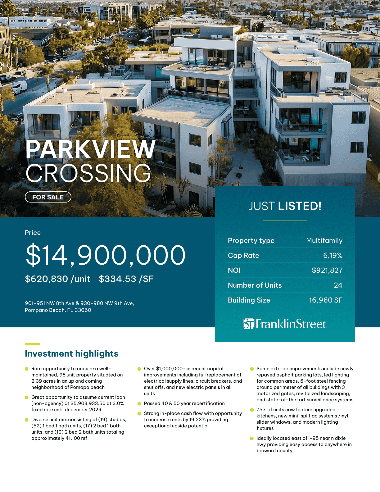
The flyers that consistently generate calls and clicks are the ones that create a specific emotional response: "this looks interesting, I need to know more." That response comes from a single strong hero image, a headline that names the opportunity, three to four financial highlights, and one clear call-to-action. Everything else is noise.
The discipline of stripping a flyer down to its essential elements is harder than it sounds, especially if you've been doing CRE marketing for years and you know how much there is to say about a deal. The trick is to remember that the flyer is not competing with the OM — it's a handoff to the OM. Its success is measured not by how much information it contains, but by how many people want more after reading it.
The five elements every strong flyer needs — and two most brokers include that weaken it
Strong CRE flyers share five elements. Every one of them is doing a specific job, and removing any of them reduces conversion.
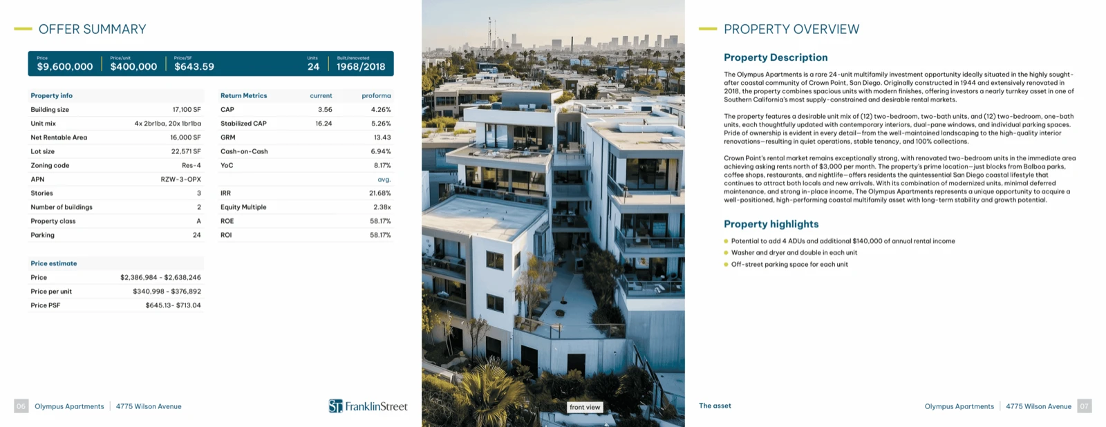
First, a full-bleed hero image. Not a thumbnail. Not a photo flanked by white space. A high-quality image that occupies most of the visual real estate and creates an immediate emotional response to the property. A great hero image communicates quality before any text is read.
Second, a headline that states the investment opportunity in one line. "NNN Retail — 6% Cap Rate, 7-Year WALT" is a headline. "Prime Commercial Opportunity in [City]" is not. Buyers scan headlines. If yours doesn't answer "why should I care" in under five seconds, it's not doing its job.
Third, a financial highlights block with four to six numbers — price, NOI, cap rate, WALT, occupancy, or the metrics most relevant to this deal type. Presented in a clean visual format, not a table. Numbers in boxes convert better than numbers in sentences.
Fourth, a property highlights section. Three to five bullet points that communicate the deal's key advantages — not boilerplate ("great location, stable income") but specific, differentiated points ("100% leased through 2031 to a single investment-grade tenant with no co-tenancy risk").
Fifth, a clear call-to-action with the broker's name, phone number, and a URL or QR code. One call-to-action. Not three.
For a deep dive on what makes each element work, the creating a winning CRE flyer guide covers design and copy principles in detail.
The two elements that weaken flyers: a lengthy market commentary section and a legal disclaimer in the body. Market commentary belongs in the OM. A disclaimer is necessary, but it belongs in a small-type footer — not in a text block that competes with your financial highlights for visual attention.
Digital vs. print: how the format changes the design priorities
A flyer designed for print will often look wrong on a screen. A flyer designed for digital will often print flat and hard to read. The mistake is using one template for both — which means you're likely compromising both uses rather than optimizing either.
For digital distribution, the key design priorities are: legibility on mobile screens (which means larger type than you think you need), a single-column or stacked layout that reads naturally when scrolling, and high-contrast color choices that survive rendering on different screen calibrations. Digital flyers also benefit from embedded hyperlinks — the property address, the listing website URL, and the broker contact should all be clickable, because a buyer reading your flyer on a phone should be able to get to the listing website with one tap.
For print distribution, priorities shift. Print tolerates more detail because readers can hold it, zoom in, and set it aside for later. Typography choices matter more — sans-serif fonts that look clean on screen can look clinical in print; a hybrid that uses a display font for headlines and a clean serif for body copy often reads better in physical form. Print also requires careful attention to bleed and margin — digital margins that look fine on screen will produce cut-off elements on a physical print if the file isn't properly sized.
The property flyer tools in IntellCRE generate output optimized for both formats from the same intake. If you're building flyers manually, the practical answer is to design for digital first (the dominant use case), then check the print preview and make targeted adjustments for any elements that don't translate.
The one element that should be identical across both formats: the headline and the financial highlights block. That consistency is what makes your brand recognizable when a buyer sees multiple deals from you over time.
Where flyers fit in the launch sequence: before the OM, not instead of it
The most common misuse of the property flyer is treating it as a compressed version of the OM — something you send after the OM is ready, as a convenience for buyers who don't want to read the full document. That inverts the actual purpose.
The flyer belongs at the beginning of your launch sequence, not the end. It's the teaser — the first thing that goes out to the market, before the OM is ready and before the listing website is live. Its job is to surface buyer interest and create anticipation for the full campaign. A well-distributed flyer at T-minus-5 days from your OM launch generates a warm audience of buyers who are already engaged by the time the full package arrives.
Run your launch sequence like this: flyer + teaser email (one week before OM launch) → listing website goes live (three to five days before OM launch) → OM launch with call-for-offers timeline. The flyer seeds the market. The listing website captures engagement. The OM delivers the full investment case.
The Listing Launch Guide covers the full sequence in detail. What matters from a flyer standpoint is that your flyer is ready before your OM — not as an afterthought, but as a deliberate first-touch piece designed to build a warm audience before you ask for offers.
One practical implication: since the flyer goes out before the OM, it should not include information you're not ready to have in the market. Don't put the asking price on the flyer if you're running a best-offer process. Don't include terms that might change. The flyer creates awareness — the OM creates commitment.
How to repurpose flyer content across email, social, and direct mail
A well-built flyer is more than a single-use document — it's a content source that feeds multiple distribution channels without requiring additional production time.
For email campaigns, the flyer hero image and financial highlights block translate directly into the email body. Instead of designing a separate email layout, pull the property image, headline, and four financial highlights out of the flyer and drop them into your email template. The flyer CTA becomes the email CTA. You've cut your email production time to near zero, and the design is consistent with the physical flyer the buyer may also receive.
For LinkedIn and Instagram, the hero image with a text overlay of the headline and cap rate performs well as a static post. Keep it clean — one image, one headline, one number, one URL. Carousel posts that walk through the five highlights work even better for engagement, and the five-element structure of your flyer is already a natural carousel.
For direct mail, the flyer is the mailer. Print format flyers sent to a targeted list of owners in the submarket serve a dual purpose: they advertise the deal to potential buyers who also own adjacent assets, and they signal market activity to prospective listing clients who may be thinking about their own exit. Keep the design identical to the digital flyer — consistency builds brand recognition, and an owner who receives your flyer in the mail and then sees it on LinkedIn is three times as likely to associate your name with professional, high-volume deal activity.
Batch your production. When you create the flyer for a new listing, also create the email snippet, the social post image, and the print-ready version in the same session. That batching discipline is what separates brokers who feel constantly behind on marketing from the ones who always seem to have a professional presence in the market.
Frequently asked questions
How many pages should a CRE property flyer be?
One page for 90% of deals. Two pages if the deal genuinely requires a second page to communicate the thesis — for example, a multi-tenant retail strip with a tenant mix worth naming. Never three pages. A flyer that needs three pages to tell its story is trying to be an OM.
Should I put the asking price on the flyer?
If you're running a stated-price process, yes. If you're running a call-for-offers or best-offer process, use a cap rate guidance range instead. "Offered at a 5.75 cap" is enough information to qualify buyers without anchoring them at a specific dollar figure before the OM is in their hands.
What's the right image size for a digital flyer?
For email distribution, design at 600px wide — that's the standard email client width. For LinkedIn posts and social media, 1200x627px works well for link previews. For print, design at 8.5x11 at 300dpi minimum. If you're building one file to serve all three purposes, design at print resolution and export separate lower-res versions for digital use.
How do I create a flyer without a graphic designer?
Template-based tools that allow you to input property data and generate a branded, properly laid-out flyer are the most efficient solution for brokers without in-house design support. The key is that the template should be locked — colors, fonts, logo placement, and layout should be non-negotiable, so the only thing varying between deals is the property data and images.